Elevate Fitness
This poster was designed to clearly communicate the launch of a luxury fitness studio while reinforcing a premium brand position and driving action. The design uses a strong central image to quickly convey the studio’s high end environment, supported by a clear typographic hierarchy that guides the viewer from brand name to event details. Key design principles such as contrast, alignment, and proximity are used to improve readability and structure, while shape elements and repetition create visual organization and consistency. The layout is intentionally simple and controlled to prioritize clarity over decoration, culminating in a direct call to action that encourages immediate engagement.
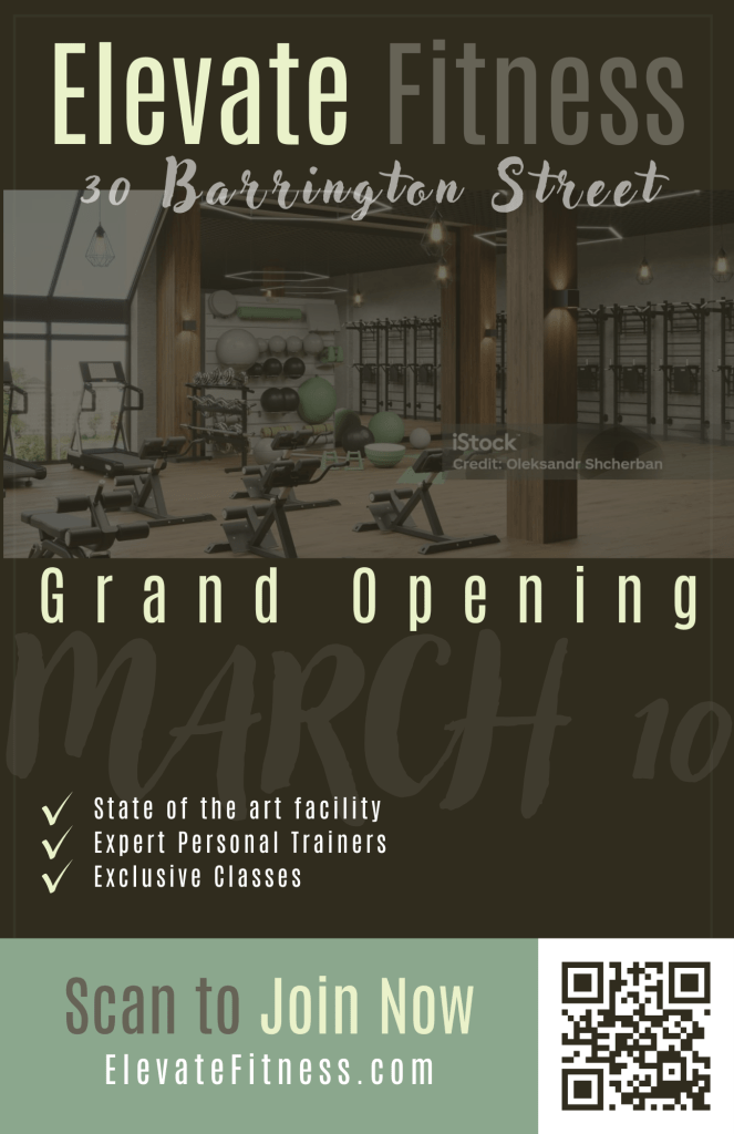
Creative Rationale for Elevate Fitness Grand Opening Poster
This poster was developed as a communications deliverable to support a luxury fitness studio launch. The design goal was to deliver immediate message clarity, reinforce a premium brand position, and drive a clear call to action. The overall approach prioritizes communication outcomes over decoration, consistent with best practices in promotional print design.
A photographic hero image is used as the primary attention driver. The studio interior image communicates the product promise quickly: a modern, high-end space with professional equipment and an elevated experience. Placing the photo centrally supports credibility and reduces ambiguity by showing the environment rather than relying only on descriptive copy.
The layout is built around strong typographic hierarchy. The studio name, “Elevate Fitness,” is positioned at the top as the primary identifier, using scale and contrast to establish brand recognition first. The event message, “Grand Opening,” functions as the secondary headline and is set with increased tracking to create a refined, upscale tone. Key supporting information, including the address and feature list, is intentionally set smaller to maintain a clear reading order and prevent competing focal points.
Several core principles of design were applied to improve legibility and visual control. Contrast is used throughout, with light type placed on dark fields to ensure readability at distance, which is critical in poster format. The design also uses alignment and grid structure to create professionalism and predictability: elements follow consistent left alignment and spacing, reducing visual noise and improving scanability. Proximity is used to group related information, such as the service benefits list, so the viewer can process the offering as a single unit.
Shape elements are incorporated to support hierarchy and separation. Semi-transparent bands and blocks sit over the photo and background to create clear zones for text, preventing the photograph from interfering with legibility. Repetition is introduced through consistent check marks and spacing in the benefits list, creating rhythm and reinforcing the idea of curated, premium services.
The call to action is treated as the final conversion point. The bottom panel uses a lighter color block to create a distinct visual section and leads the viewer directly to the QR code. The CTA copy, “Scan to Join Now,” is intentionally direct and action oriented, ensuring the poster functions as a communication tool and not simply a brand impression.
Overall, the design integrates hierarchy, contrast, alignment, proximity, repetition, and balance to deliver a polished, business appropriate poster that communicates quickly and supports an actionable outcome.
